Generative UI
Generative UI is what a Web Agent draws in a reply besides text: cards for your records, tables, charts, forms and buttons. You choose which components the agent can use and how they look in the agent's Generative UI tab.
An agent that only guides has no Generative UI tab.
How it works
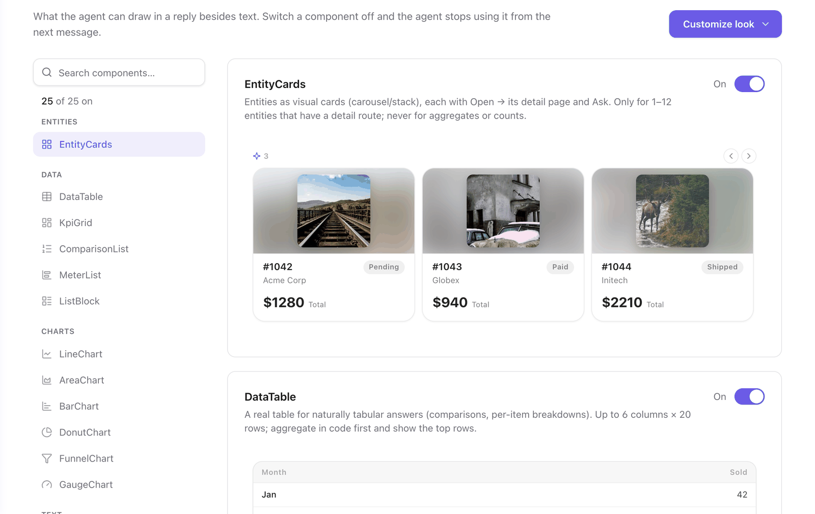
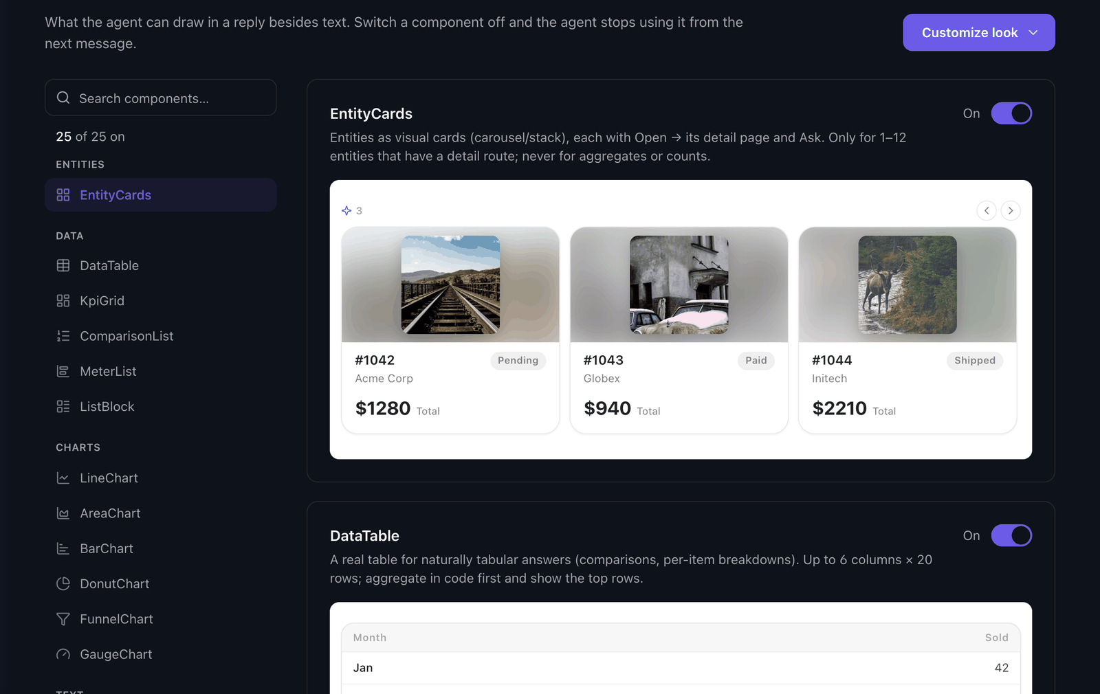
The agent composes a reply from a catalog of 25 components. When an answer is a set of records, a comparison or a trend, the agent picks the component that fits and fills it with the data its actions returned. The tab lists every component with a description, a switch and an example drawn by the real widget in your agent's colors.
The components
| Group | Components |
|---|---|
| Entities | EntityCards, and the cards you import from your app |
| Data | DataTable, KpiGrid, ComparisonList, MeterList, ListBlock |
| Charts | LineChart, AreaChart, BarChart, DonutChart, FunnelChart, GaugeChart |
| Text | Callout, Text, Heading, Badge, TagList, Progress, List, Steps, Image |
| Input | Form |
| Actions | Button, ActionGroup, Followups |
EntityCards draws 1 to 12 records that have a detail page, each with a link to open it. DataTable draws up to 6 columns and 20 rows. A Button or a Form can run one of the agent's actions in the page. An action that is destructive asks the user first.
To stop the agent from using a component, see Turn components on and off.
The look of the components
By default the components have Faustine's look. Customize look in the Generative UI tab gives them your app's font family, corners, borders, shadows, density and buttons.
| Option | What it does |
|---|---|
| Match my app | Faustine reads your app's code and proposes a look. See Match the look of your app. |
| Adjust by hand | You set each value, with the components in front of you. See Match the look of your app. |
| Import components | Faustine finds the cards your app draws for its records and uses them in the chat. See Import your own components. |
| Design with AI | You describe the look in the Advanced editor. See Design components with AI. |
The three colors of the components are the ones of the widget. They are set in Look & feel, under Brand. See Appearance.
What to know before you change it
| Change | When your users get it |
|---|---|
| A component's switch | From the next message, when you save. No publish. |
| The look of the components | When you publish a version and deploy it. |
| An imported component, added or removed | With a publish and a deploy, like the look. |
Reading your code for a look or for components runs on your model provider and costs tokens. Applying what a read found does not.
Next steps
- Turn components on and off: keep the agent from drawing a component.
- Match the look of your app: take the corners, borders and buttons of your app.
- Import your own components: show your own cards for your records.
- Design components with AI: describe the look in words.
Last updated November 13, 2026