Build a custom widget
At the end of this tutorial, the Nimbus CRM agent opens in a side panel that has the app's font, corners and colors, so it reads as one more panel of the app.
A custom widget is the sixth presentation. You build it in a wizard of six steps, with the real widget drawn next to the steps and redrawn with every choice.
In this tutorial, you:
- Open the wizard
- Choose the look to start from
- Choose the placement, the surface and the answers
- Choose the header and the shapes
- Save, publish and deploy
Before you begin
- A Web Agent for Nimbus CRM with a version published and deployed. The wizard draws the real widget, and it needs a published version to do it. See Build your first Web Agent.
Open the wizard
- In the portal, go to Web Agents and select the Nimbus CRM agent.
- Select the Look & feel tab.
- Under Presentation, select the Custom card.
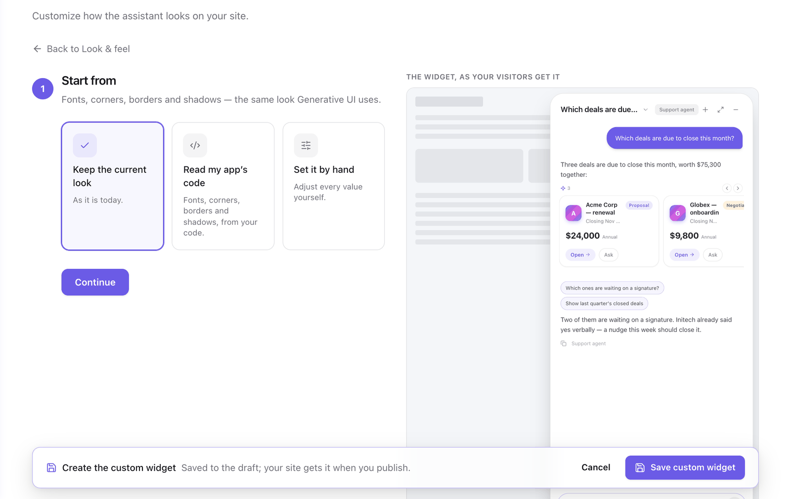
The wizard opens inside the tab. The steps are in one column, and the widget is beside them over a sample conversation. Each step closes when you select Continue, and Edit on a closed step opens it again.
1. Start from
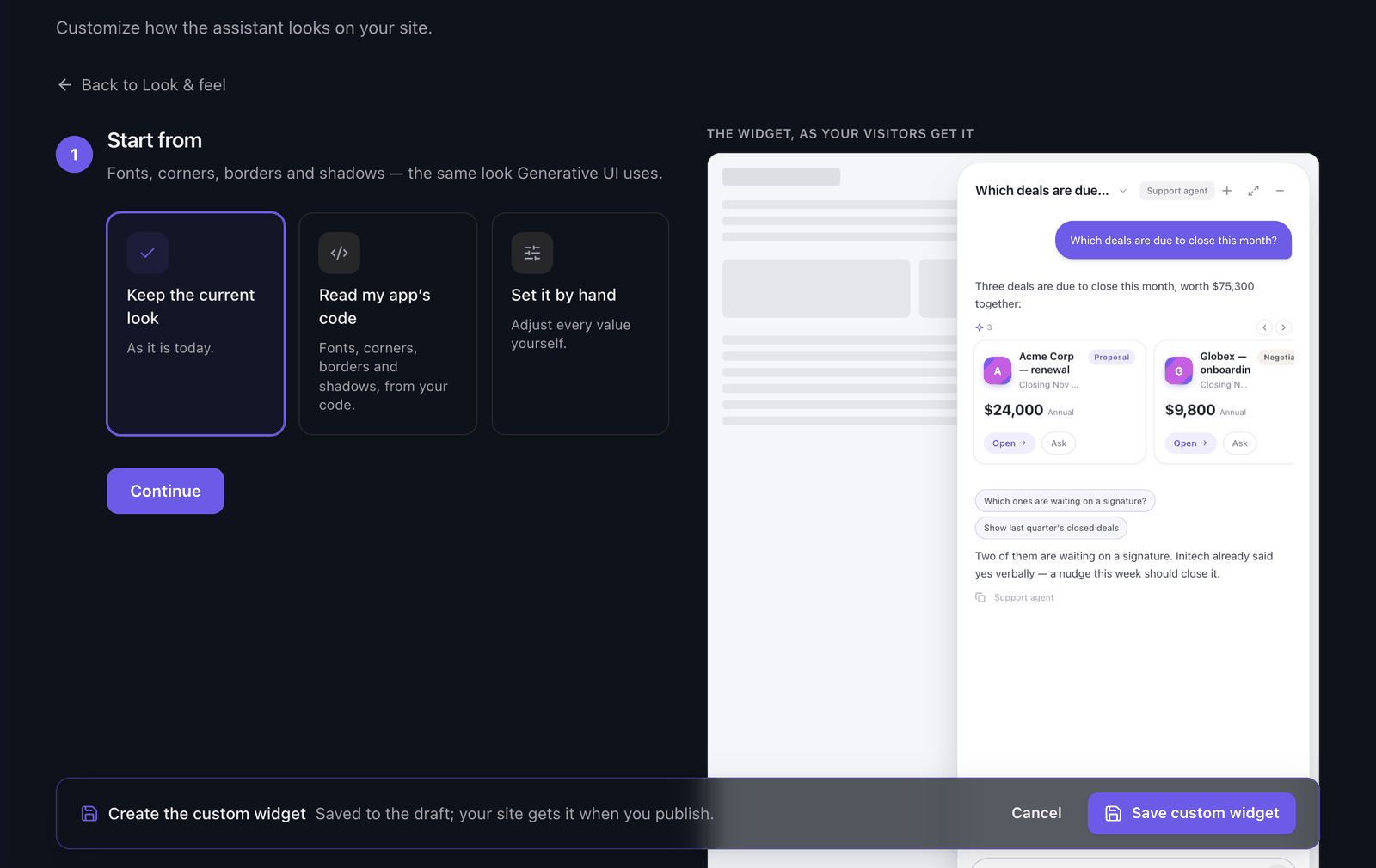
This step chooses the look the widget builds on: its font, corners, borders and shadows. It is the same look the components in a reply use.
| Option | What it does |
|---|---|
| Keep the current look | Leaves the look as it is. |
| Read my app’s code | Reads the look from the repository. |
| Set it by hand | Shows the same values as Adjust by hand in the Generative UI tab. |
For Nimbus CRM:
- Select Read my app’s code.
- Select the Read my app’s code button in the card that appears. The read runs on your model provider, costs tokens and takes a minute or two.
- When the card shows the date of the read and a confidence badge, the read is done. If the card offers Use my app’s brand colours, leave it selected. The widget takes the background, text and primary colors found in Nimbus CRM.
- Select Continue.
The widget beside the steps now has the app's font and colors. If the agent already has a look read from the code, the card shows it and you can continue without reading again.
2. Placement
- Under Placement, select Side panel. The widget takes the full height of the page, flush with the edge. Floating window keeps a margin all around.
- Under Side, leave Right. Nimbus CRM has its navigation on the left.
- Select Continue.
With Left, the widget opens away from the launcher's default corner. Move the launcher under Launcher in the Look & feel tab. See Choose a launcher and its position.
3. Surface
- Select Solid. The panel is opaque, in the background color from step 1.
- Select Continue.
Glass is frosted and the page shows through. Clear puts the messages over the page on a light veil.
4. Answers
- Select Plain. The agent's answers are text directly on the surface.
- Select Continue.
Bubble draws each answer in its own box.
5. Header and shapes
This step asks four things.
- Under Header, select Minimal. The panel shows its controls only. Title bar adds the conversation title and the agent's name.
- Under The widget’s shapes, leave Your app’s look. The window, the bubbles, the composer and the conversations list take the corners, border and shadow read in step 1.
- Under The components’ shapes, select Your app’s look. The cards, tables and buttons in the agent's replies take the same look. This is the same setting as the look switch in the Generative UI tab.
- Under Full screen, select Not offered. A side panel that fills the page would cover the app.
- Select Continue.
6. Review
The last step lists the Look, the Widget and the Components you chose.
- Compare the widget beside the steps with Nimbus CRM. To change a choice, select Edit on its step.
- Select Save custom widget.
The Look & feel tab opens again with the Custom card selected. The card reads "Side panel · right · solid · plain answers · minimal header · your app’s shapes · no full screen".
Saving writes the widget, the look and the brand colors to the draft. To send them to your users:
- Publish a version.
- Deploy the version to the environment Nimbus CRM loads.
Checkpoint
Reload Nimbus CRM and open the agent. It opens as a panel on the right, with the app's font and colors.
What you built
The Nimbus CRM agent has a custom widget: a solid side panel on the right with the app's look and a minimal header. It is the Custom card under Presentation, and Edit on the card opens the wizard on its review step.
Selecting another presentation keeps the custom widget for later.
Next steps
- Presentations: every option of the custom widget and its default.
- Choose a launcher and its position: put the launcher where the panel opens.
- Import your own components: show Nimbus CRM's own cards inside the panel.
Last updated November 11, 2026