Appearance
Appearance is everything your users see of a Web Agent before it answers: the widget, the launcher that opens it, its colors and its first lines. You set it in the agent's Look & feel tab, next to a live preview.
How it works
The Look & feel tab is one page of sections with a Live preview beside them. The preview follows what you edit. It shows the open chat while you change the presentation and the page with its launcher while you change the launcher. The Chat and Launcher buttons above the preview switch between the two.
Nothing is saved until you select Save changes. Saving writes to the draft. Your users get the change when you publish a version and deploy it, and every version keeps the appearance it was published with.
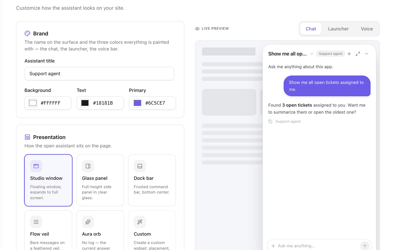
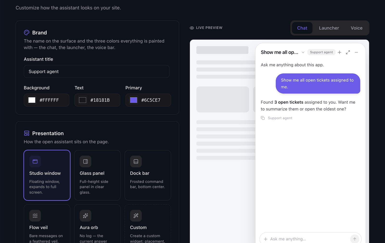
Brand
Brand holds the name and the three colors that paint the chat, the launcher and the voice bar.
| Field | What it sets |
|---|---|
| Assistant title | The name shown on the widget. |
| Background | The widget's background. |
| Text | The text color. |
| Primary | Buttons and accents. |
After Faustine has read your app's look, Brand offers the colors it found in your code. Use these fills the three fields. See Match the look of your app.
Presentation
The presentation is how the open widget sits on the page. There are five built-in presentations, and Custom, which you build in a wizard.
- Presentations describes each one.
- Build a custom widget walks through the wizard.
Launcher
The launcher is what users select to open the agent: a floating orb, a tab on an edge, a command bar or a card that offers help. You can also render no launcher and open the agent from your own button.
Conversation and behavior
Conversation sets the greeting, the composer's placeholder and the suggestions a user sees on a new conversation. Behavior sets the keyboard shortcut and whether the widget opens by itself on a first visit. See Set the greeting, placeholder and shortcut.
Voice
Where voice is available, the tab has a Voice section and the preview has a Voice button. See Voice.
The components inside a reply
The cards, tables and buttons the agent draws in a reply take the three Brand colors. Their shapes are set in the Generative UI tab. See Generative UI.
Next steps
- Presentations: choose how the open widget sits on the page.
- Choose a launcher and its position: choose what opens it and where it sits.
- Build a custom widget: make the widget look like part of your app.
- Publish a version: send the appearance to your users.
Last updated November 11, 2026